On the homepage, we chose not to overwhelm users with excessive detail from the start.
Visit the website www.ventra.ru
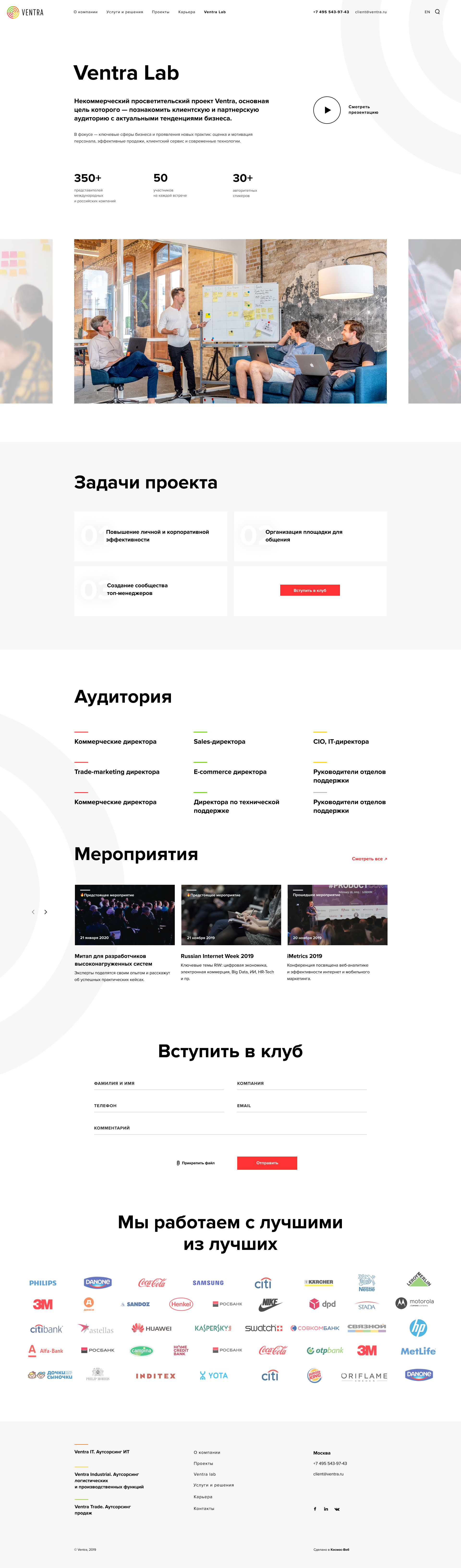
There are many service lines — and the website attracts a diverse audience. To ensure the best user experience, we highlighted the main directions on the first screen: Ventra Trade, Ventra IT, Ventra Industrial.
That’s why the website contains almost no infographics — just real, authentic content.
Each service section features only the most important facts and figures, along with a mini portfolio of relevant work.
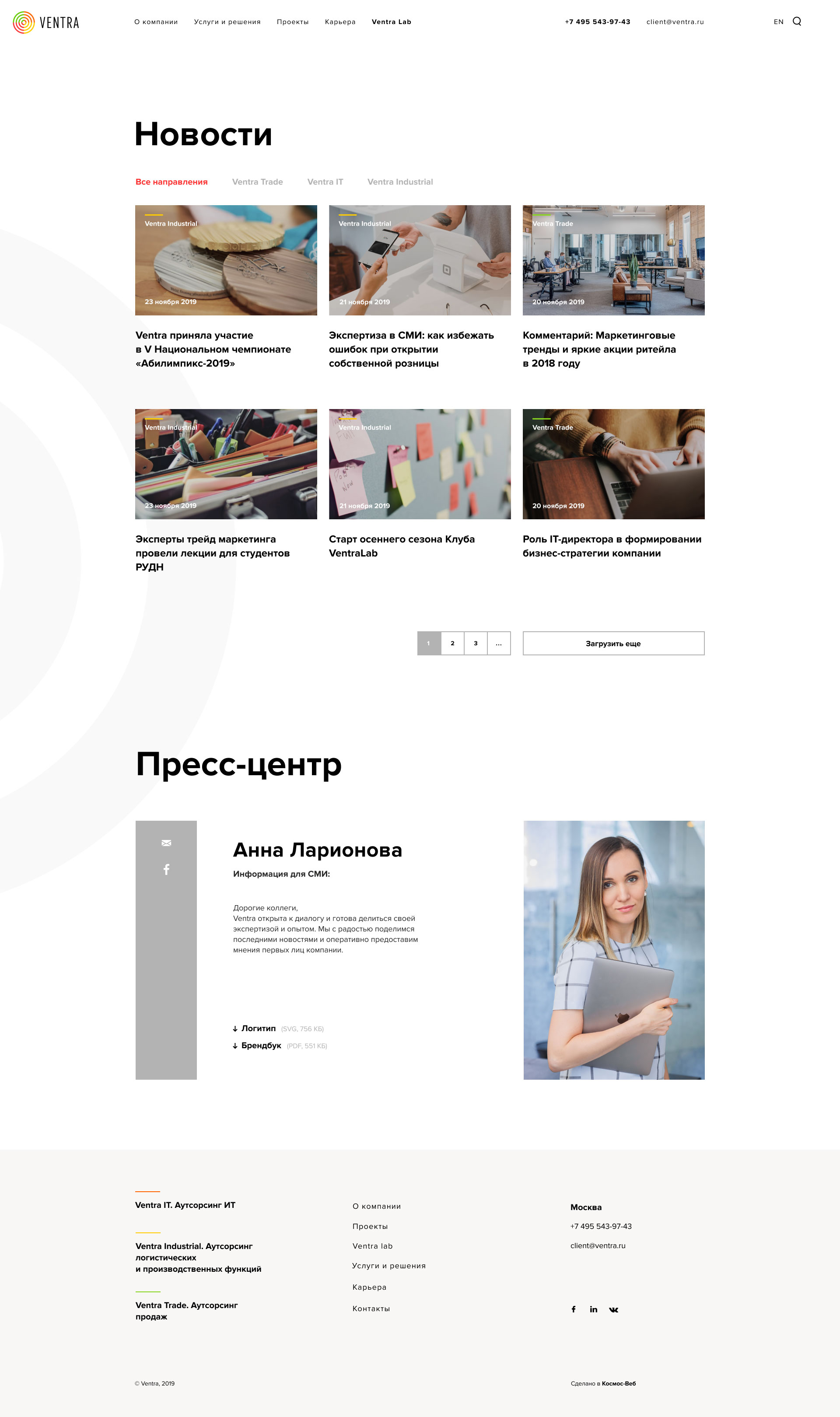
The case studies are minimalist, but still informative. A few numbers and a couple of images quickly tell everything the user needs to know about the results.
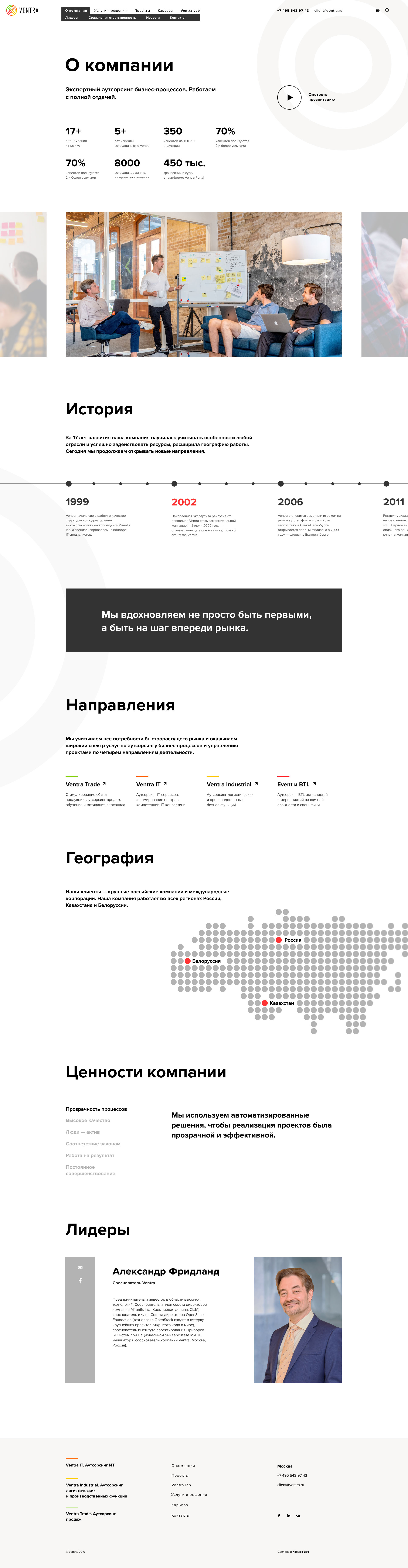
Even with a large volume of content, the website feels light and unobtrusive — thanks to well-placed accents and a carefully structured flow of information.
Content management and website updates are handled by the client.