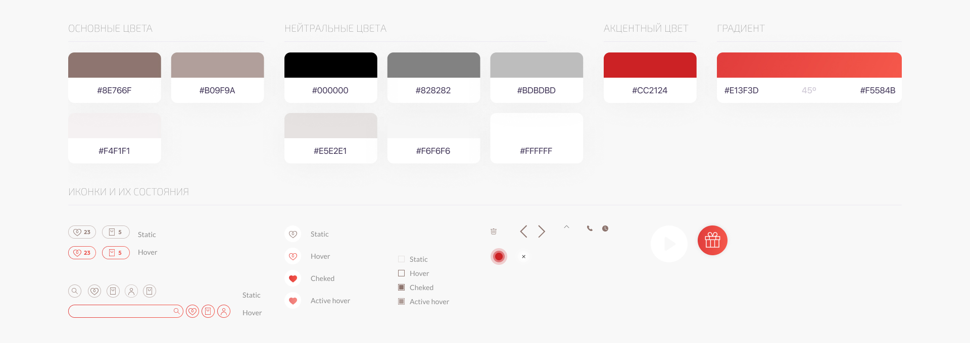
Despite the brand’s scale, the client had no established brand identity — only a logo and a few promotional banners.
Visit the website www.monro.biz

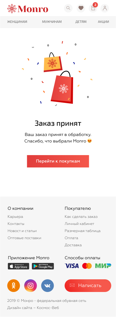
We created a complementary color palette for the interface and designed stylish, minimalistic icons. Red was used to highlight promotions and discounts.
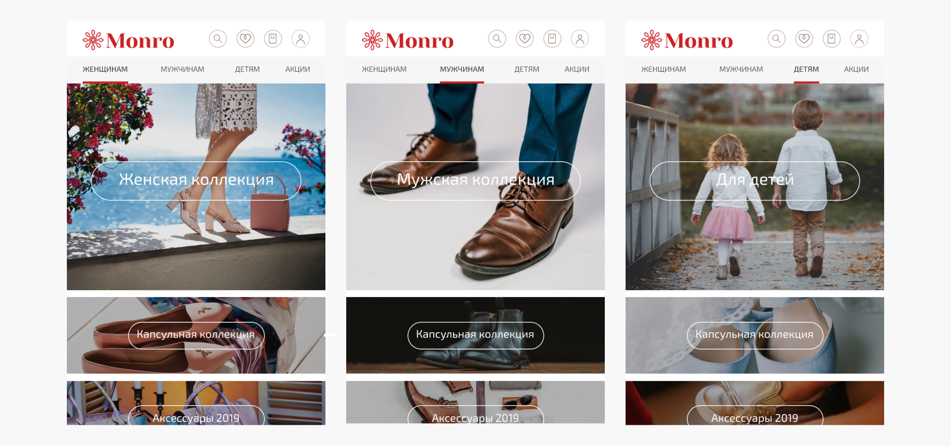
The client intended to use this functionality in advertising campaigns. For example, if a woman lands on the website from a promo, she sees the women’s section by default — and similarly for men and children.
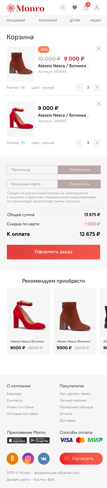
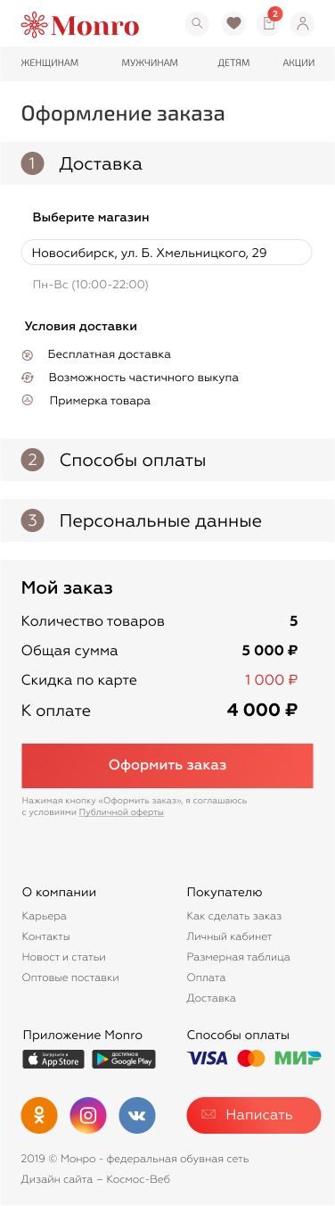
Most customers access the website via smartphone, so the mobile version was designed to be as convenient and functional as a full app. We removed unnecessary elements and placed all checkout steps on a single page. Navigation between sections of the personal account was simplified.
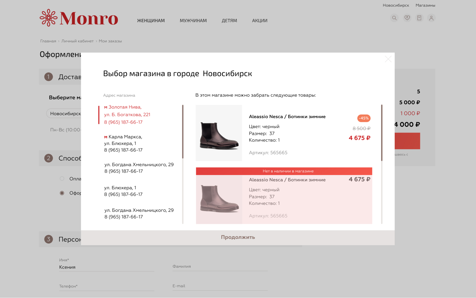
An inconvenient product availability table was replaced with a clear interface showing which items are available for pickup at which store locations.
We handed over the finished layouts and detailed documentation to the client’s in-house team, who were responsible for back-end development.